1. The short answer: "not tasty-looking" is fine. The trouble starts when the brain decides "that's not food"
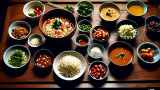
Collab food has a strange quirk. Brown chocolate soft serve is fine. In Nara, a candy sold under the name "deer poop" has lasted for decades. In a malatang (Chinese hot pot) fridge, you see fish cakes, noodles, mushrooms and dumplings that are hard to identify at first glance. People still eat them without a second thought.
But show insect legs, pus or a wound in fine detail, or make something look like rotten food, and suddenly it is "no way."
So the line is not simply "how yummy it looks." Putting the research together, a simple way to think about it is this:
Risk ≈ how much it looks like something disgusting × how realistic it is − how clearly it looks like food − how familiar it is − how much it reads as a joke or a cartoon
This is not a formula from a paper. It is my own model for organizing the ideas. But each piece matches research on food disgust, avoiding germs, color expectations, eating insects and visual design.[7][8][9][10][12][13]
So the first thing to protect in collab food is not "looks great in photos."
Don't make it look like something that isn't food.
Cross that line, and your eyes cast the instant-death spell before your tongue gets a chance.
2. Why Joyfull rarely gets it wrong: they put the character on a dish instead of making the character the ingredient
Joyfull is a Japanese family restaurant chain. Its Demon Slayer collabs use a very safe design. The 2024 collab sold over 1 million collab dishes in total. In 2026 it ran again with 13 items across Japan.[1]
Black curry, hamburger steak, spaghetti Napolitan, pork rice bowls, pancakes. The names sound scary, with demons, techniques, blood and six eyes. But the dishes themselves stay in the "looks good at a normal family restaurant" zone. The "Kokushibo Six-Eyes Tiramisu Pancakes," on sale from 3 p.m. on September 8, 2026, sound monstrous by name. In fact they are just pancakes and tiramisu.[2]
This is the key point.
- Risky design: rebuild the character's body or monstrous parts exactly, using food
- Safe design: first make a dish people already want to eat, then add the character with colors, names, small props and toppings
If you rebuild the six eyes as six eyeball jellies with blood vessels, it is more faithful to the story. But it will probably fail as food. If you arrange orange, chocolate and sauce, "it feels like six eyes" and "it's a dessert" can both be true.
A perfect score for the character is not always a perfect score as food.
3. "Blue curry = instant death" is not quite true. But blue Sulley pasta does make your brain pause
If you try to turn Monsters, Inc. into food faithfully, Sulley is the danger.
"Sulley is blue."
"Then the food should be blue too."
That is how an imaginary "blue curry (instant-death spell)" gets born. But there is a real example that comes close. At "PIXAR FEST OH MY CAFE" in 2020, a Sulley & Mike spaghetti plate was sold for 1,790 yen (before tax). Sulley's side was cream cheese pasta, shown in bright blue in the official promotional images.[3][4]
Still, it is too crude to say "blue always kills the appetite." In an experiment with 448 people, pictures of sweet foods recolored to blue, red and other colors made people want to eat them less than the original colors. But blue was not always the worst color. The researchers point to a key reason: the color did not match what people expect that food to look like.[5]
A review of blue foods says the same thing. Blue meat can be creepy, but blue drinks and sweets can sell just fine.[6]
So, to be precise:
Blue is not the problem. The problem is "why is this dish that blue?"
Blue soda is magic. Blue steak is a crime scene. Color is judged along with its context.
4. Why realistic poop-shaped chocolate is risky: disgust works like a germ-avoidance firewall
Food disgust is not just a matter of taste. A leading explanation is that disgust helps us avoid infection and contamination. Feces, vomit, sores, rot, body fluids and dirty conditions are classic things that make us feel disgusted.[8][9]
A famous experiment changed the shape of chocolate fudge. Even though people knew it was the same chocolate inside, they avoided the fudge shaped like feces more than fudge in a normal shape. Later studies also show that the setting around a food can change disgust a lot.[7]
Reason: It's chocolate.
Taste: I haven't tried it yet.
Eyes: That's poop.
Brain: Application rejected.
Here, what you see beats what it's called. Even if you write a fancy name like "Chocolat Noir," a perfect copy of the wet shine, uneven color, irregular shape and the way it sticks to the plate would be dangerous.
On the other hand, even if the word for poop is on the label, a product that looks like ordinary chocolate beans can still be seen as food. That brings us to the monster from Nara.
5. Why did the deer poop chocolate survive? "Nara," "chocolate" and "joke" kicked in before disgust
Nara's "Goshinroku no Fun" (sacred deer droppings) has a name that seems to pick a fight with disgust research. Yet it became a long seller.
In a 2015 Osaka Gas interview, the maker said it kept improving the product after launch and even studied how to make it look more like real deer droppings. Nearly 30 years after launch, it was said to account for about 80% of the maker's sales.[15] In 2009, a hotel in Nara introduced "deer droppings chocolate" as its No. 1 souvenir and said many guests bought it in bulk.[17] Today another maker sells "deer droppings chocolate dumplings," pitched as a joke souvenir you want to give to someone.[16]
Why did it work?
First, deer droppings are small, dry pellets. They look a lot like chocolate beans or cocoa sweets. Even if the maker makes it more realistic, it is hard to drift toward the wet lump of human feces.
Second, Nara Park and deer are strongly linked. The item means "souvenir from Nara" as well as "dirt."
Third, people do not buy it only because they want to eat it right now. "People at work or school will laugh" is the reason to buy. The joke is part of the product's value.
Fourth, the inside is very safe: chocolate, peanuts, rice cake and cocoa.
In points, it looks like this:
Name: poop −40
Looks: chocolate bean +60
Nara feel +50
Hand it out and everyone laughs +80
That carried it through.
You could even say that deer pooping in small round pellets saved Nara's souvenir business.
6. Why bugs are the hardest: the more you can see them, and the more real they look, the worse it gets
Bugs are often the first thing people say "I can't do that" about in collab food.
A 2022 systematic review of eating insects looked at 19 studies on disgust toward eating insects. In 17 of them, disgust lowered acceptance. Many studies also found that processed foods in which the insects or insect parts cannot be seen were preferred over foods where you can see them.[10]
An updated review in 2026 also says that disgust and food neophobia (the tendency to avoid unfamiliar food) remain strong negative factors, and that how visible the insects are and the form of the product matter.[11]
A 2024 packaging study also found that mealworms and crickets shown in less realistic drawings caused less disgust and made people more willing to eat and buy them than realistic, photo-like ones. The same result appeared in 3 experiments.[12]
So if a product team says,
"The character is an insect, so we copied every leg, segment, antenna and hair exactly!"
that may be a perfect score for craftsmanship, but it is dangerous as food.
With bugs especially, the more faithful you make it, the harder it is to sell.
Safer routes are: powder, then pattern, then cartoon style, then a decorative pick.
7. Still, chocolate soft serve and "Takina's special" survive: cartoon style and clear food signals help
Then why is swirled brown chocolate soft serve fine?
If you cut out only the shape, you could say it looks like poop. But in real life it comes with lots of signs that it is food: the cone, the soft-serve machine, the even swirl, the cold dessert counter and a sweet smell.
The brain files it as "chocolate soft serve" first. The look-alike joke only comes later, as "now that you say it, ha."
In episode 8 of Lycoris Recoil, Takina makes a "hot chocolate parfait." In the story it gets teased for looking like poop, yet it becomes a hit. To be exact, it is not a Shiro-Noir (a dessert from the Japanese coffee chain Komeda).[18] This is fiction, not experimental data, but the way the joke works is easy to see.
Clearly food + cartoon style + clearly a joke
If it has all three, it can survive even when its shape looks like something disgusting.
On the other hand, if a craftsperson says, "It's not realistic enough," and starts adding wetness, texture, uneven color and even the warmth of feces, then the better their skill gets, the worse the food check gets.
8. A malatang fridge or tapioca doesn't need to look yummy to pass
Look at a malatang ingredient shelf for the first time. You see clear noodles, fish cakes, mushrooms, leafy greens, balls and tofu. It is hard to say it wins on photo appeal. Tapioca pearls are the same: just black beads, not an obvious appetite trigger like a steak.
They still pass. The likely reason is that, before they look yummy, you can tell they are ingredients.
Sight is often our first contact with food, and color, shape, amount and arrangement affect whether we accept it or choose it.[13] Research on unfamiliar foods also finds that disgust, fear and food neophobia increase refusal, while familiarity and curiosity increase acceptance.[14]
So:
- Malatang: the ingredients may look mysterious at first, but the context is clear: "pick from here and cook it in soup"
- Tapioca: black beads, yes, but people have already learned they are "chewy, sweet drink toppings"
- Deer poop chocolate: the name is risky, but it stays in a shape people can learn as "chocolate candy"
Looking yummy is a bonus. Being recognized as food is the entry ticket.
9. The biggest hidden factor is realism: in collab food, higher resolution is not always better
The idea that explains all this best is realism.
Take bugs. An icon, an illustration, a photo and a life-size 3D model get closer to the real thing in that order. Take eyeballs. A round white dumpling with a black dot is a different thing from one with blood vessels, a wet cornea and a pupil.
Food design research also says that shapes far from what people expect can raise the sense of risk, and that visual details affect expected taste and choice.[13]
So in collab food, this paradox holds:
There is a point where the more faithful you are to the story, the less faithful you are to food.
Rotting zombie flesh, parasites, wounds, eyeballs, feces and mold all cross that point easily.
If someone in a product meeting says "make it more real," stop for a moment.
It may score 100 on character approval and fail on appetite approval.
10. Collab food QC: first check you haven't crossed the "food no-go line"
From the research and the examples, the risk levels roughly line up like this.
| Risk | Motif | Why it is risky | How to avoid it |
|---|---|---|---|
| SSS | Maggots, cockroaches, parasites, pus, vomit, rot | Strongly linked to germs and contamination | Hide the shape, make it abstract, move it to a pick |
| SS | Realistic eyeballs, wounds, organs, feces | Looks too much like a body or contamination | Cartoon style, keep a food-like texture |
| A | Blue curry, oddly colored meat or noodles | Breaks the color people expect from the food | Use blue on the plate, in a drink, or in a small area |
| B | Deer poop chocolate, chocolate soft serve | The shape is risky but the food context is strong | Make the joke and the sweet-treat look clear |
| C | Mystery malatang ingredients, tapioca | Not pretty, but people learn they are food | Add cooking context, explanation and familiarity |
Five practical rules are enough.
- First make a dish people already want to eat.
- Put the character on the dish, rather than making the character the ingredient.
- The more real a disgusting thing looks, the more dangerous it is, especially bugs, rot and body fluids.
- For odd colors, first ask whether the color is natural for that food.
- For joke products, keep a distance where it is clear it is a joke, not the real thing.
Joyfull's approach is strong because it follows these rules quite naturally. Even Kokushibo's six eyes, something you would normally never bring to a dinner table, end up as a pancake.
In the end, the strongest rule for collab food is this.
Don't turn the character into food. Make the food a little like the character.
Blue curry is the instant-death spell. Deer poop chocolate survives. Chocolate soft serve survives. As for bugs, don't show the legs.
The last job of a food development team is not to copy the story.
It is to get through the checkpoint in the human brain.